

PJ Masks
Brand Refresh
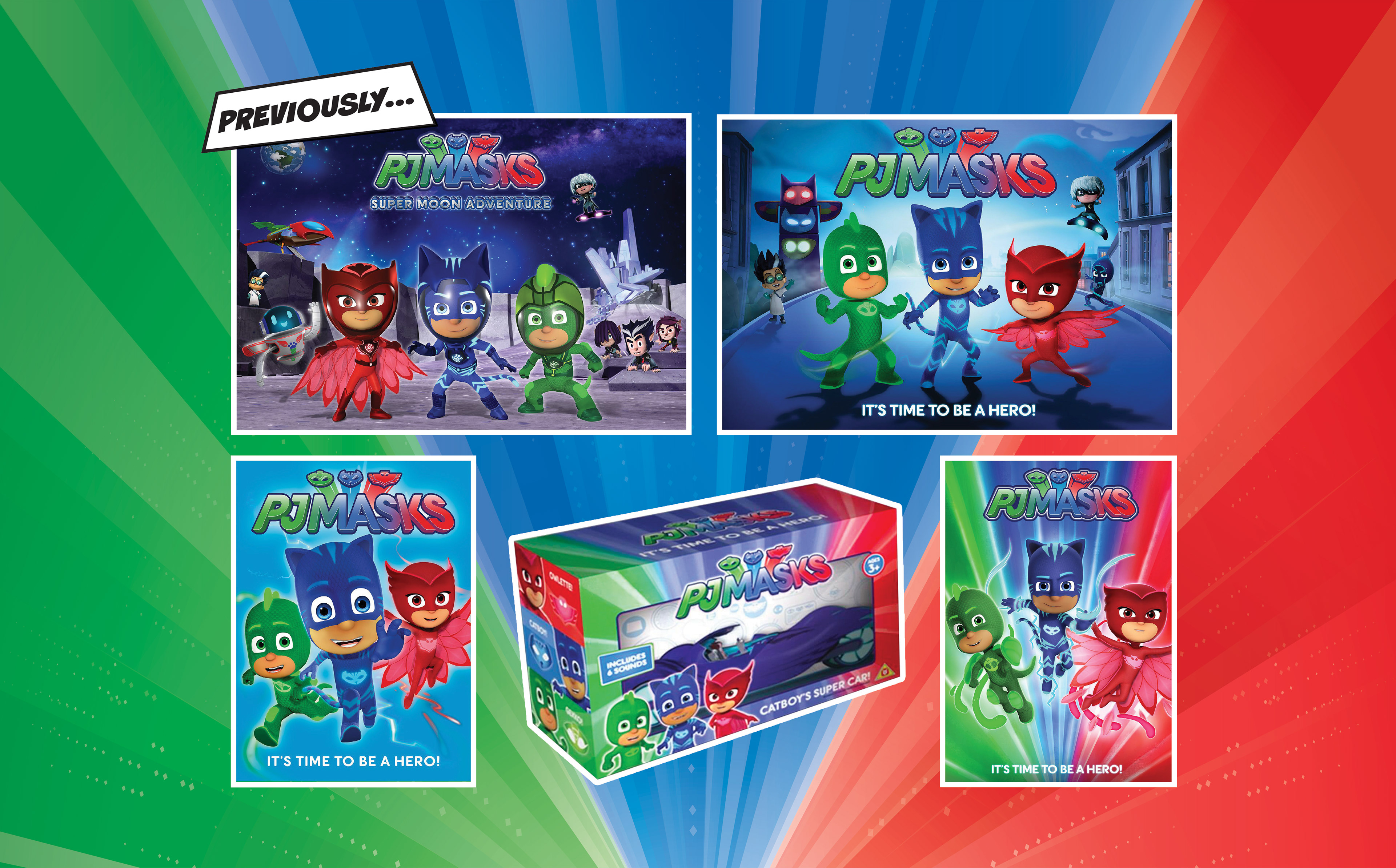
The branding for PJ Masks previously lacked a clear focus on storytelling and consisted of red, green, and blue characters on a matching background.
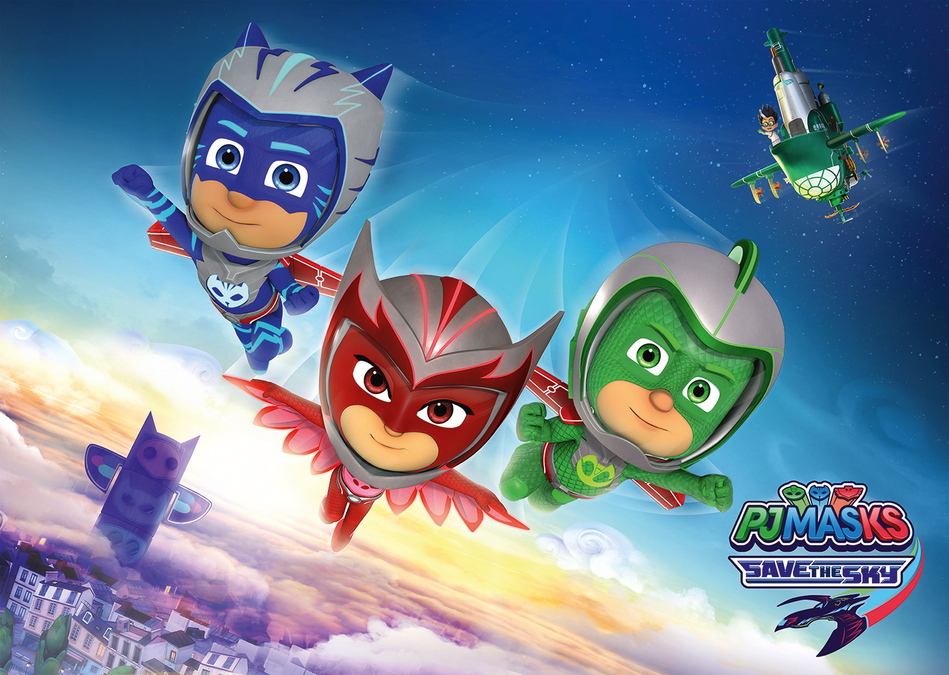
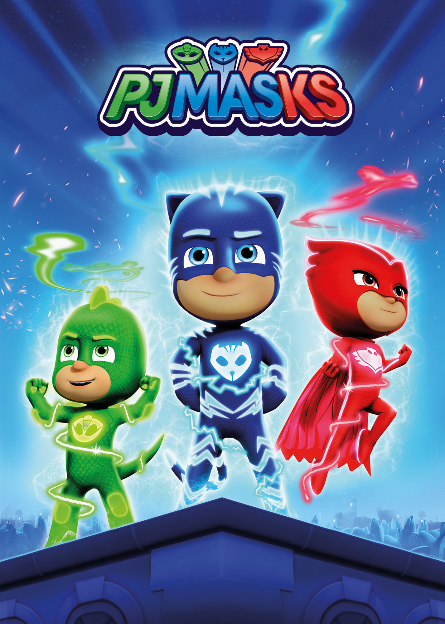
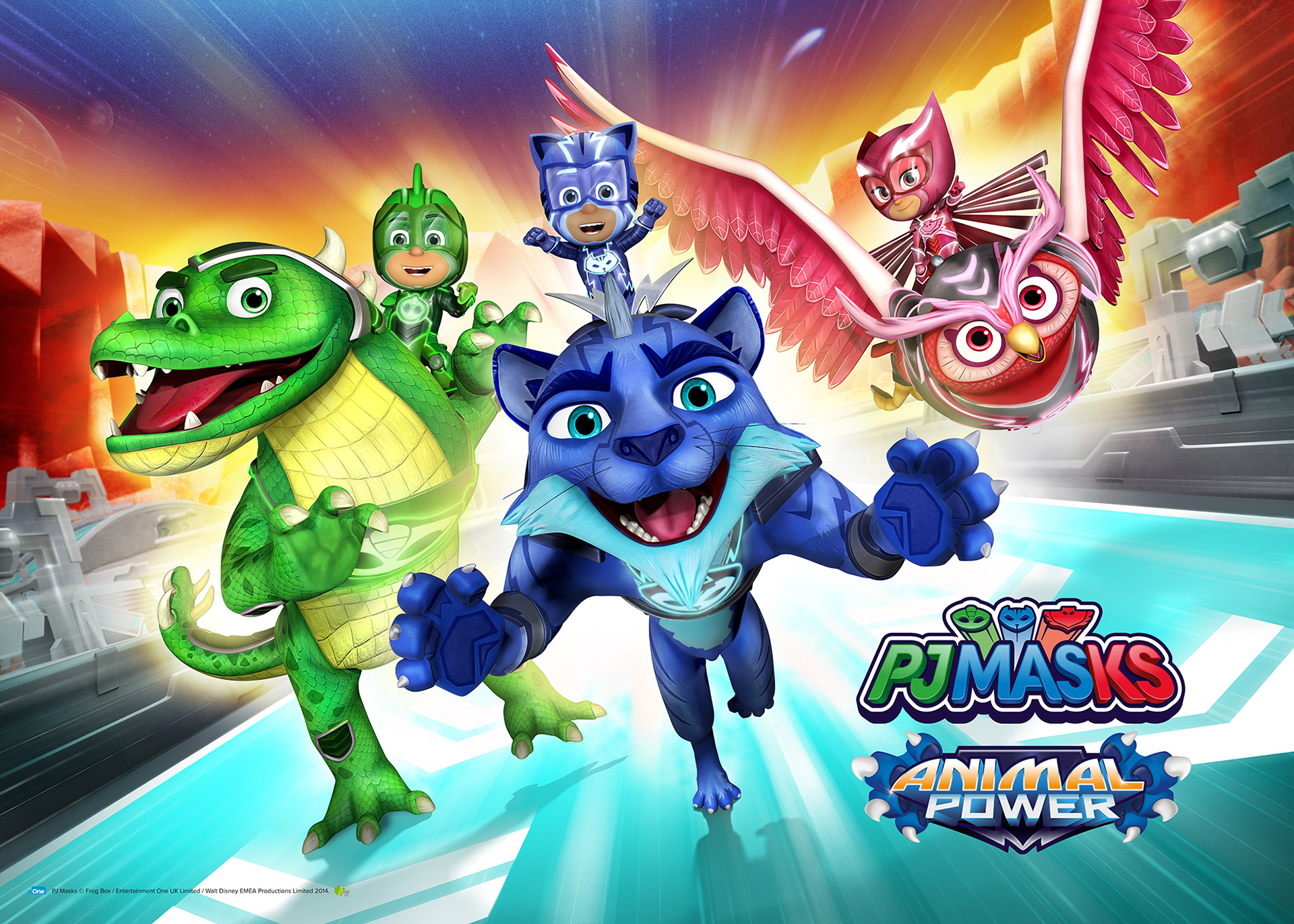
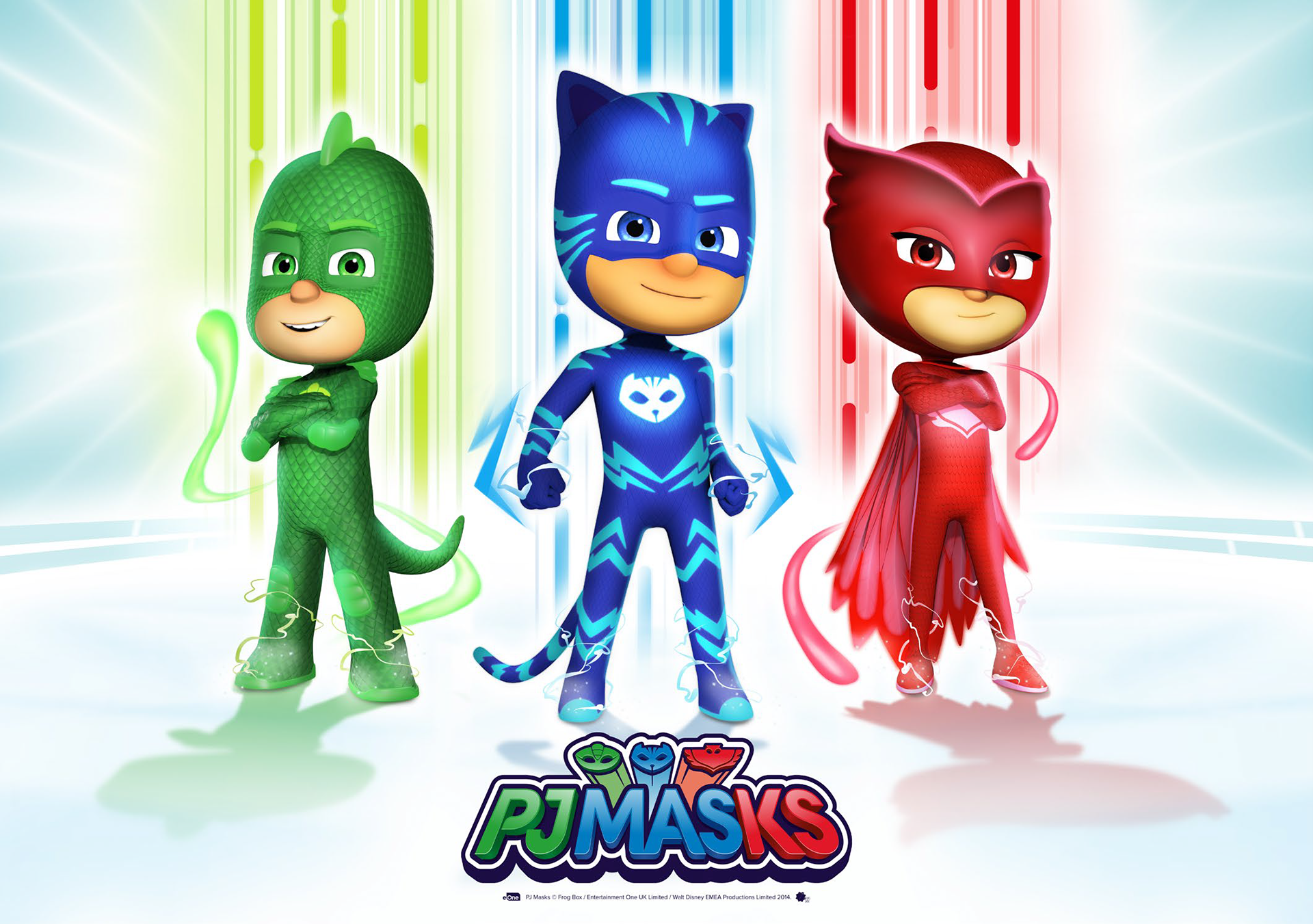
The brand re-fresh helped up-age the show's visual identity by making it more aspirational. Cute character poses were replaced with heroic, determined images that kept individual character personalities that were relevant to a preschool audience. A lighter colour palette was introduced to help the characters stand out and strengthen the hero colours and additional brand elements were created with a comic book style to help enhance the superhero theme.
The new re-brand saw revenues increase by 39%
with annual global retail sales reaching over $1.15b.
with annual global retail sales reaching over $1.15b.
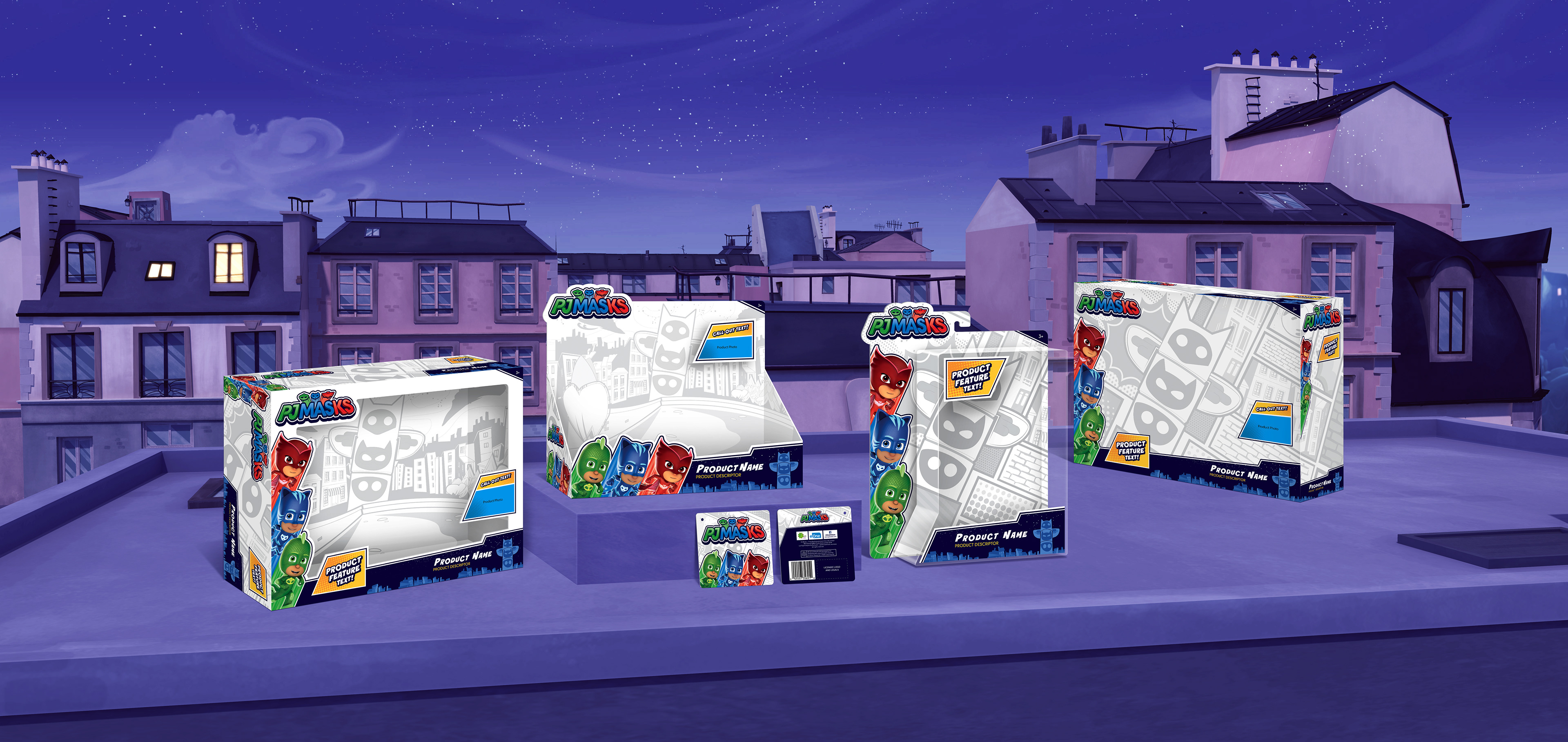
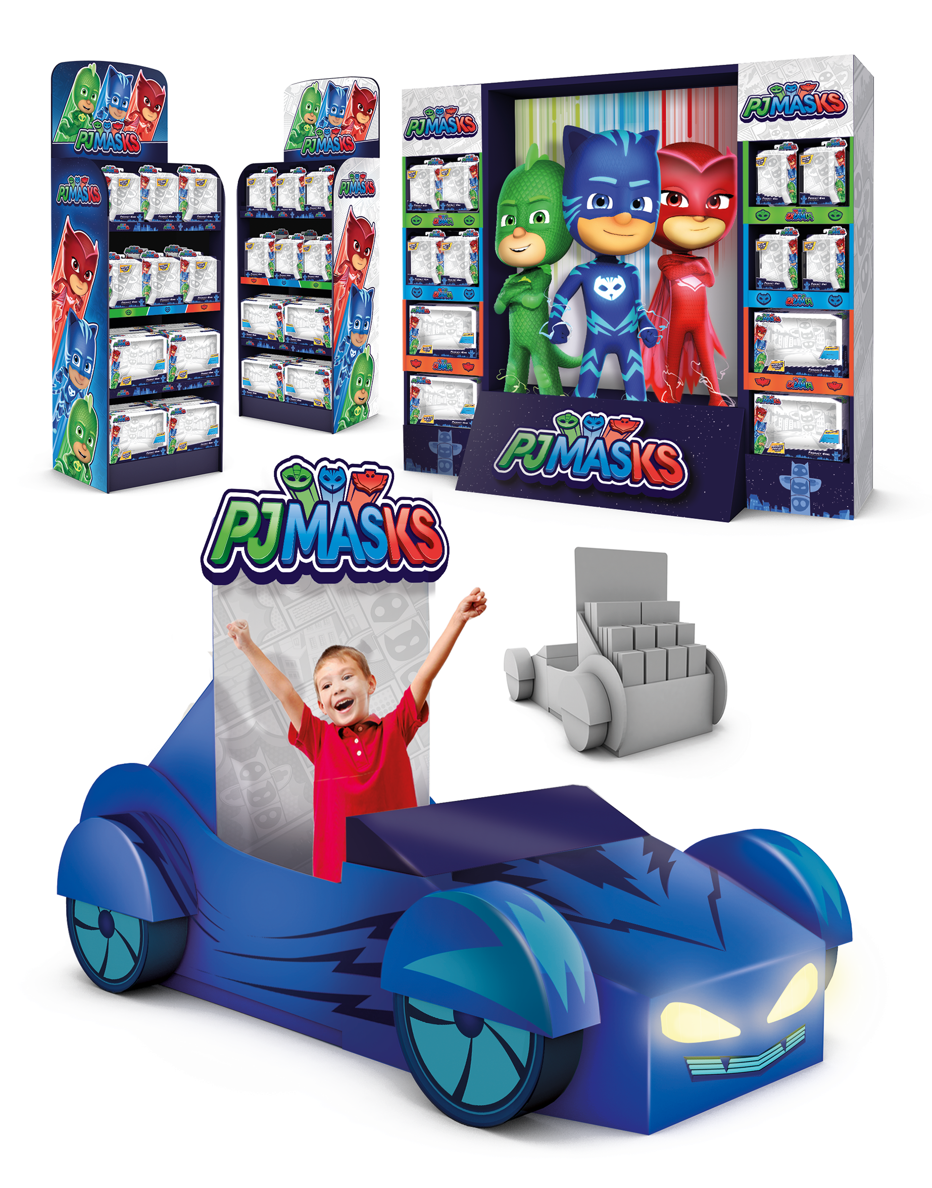
New packaging, produced with help from Design Force Inc.